DNEG’s Aymeric Perceval and Guy Hancock talk about building the CG environments, Earth’s last animals and FX needed to dramatise the potential consequences of global warming.
The anthology TV series Extrapolations, first streaming in March 2023 on Apple TV+, visualises scientifically based information about climate change, and expresses concern that our planet is changing faster than the human population can adapt to it. The show’s creators have built their 8-part series to dramatise diverse ‘extrapolations’ about what may happen to us in the decades ahead from 2037 to 2070. The episodes tell stories about love, work, faith and families around the world, as well as people’s fumbling attempts to interact with the natural world.
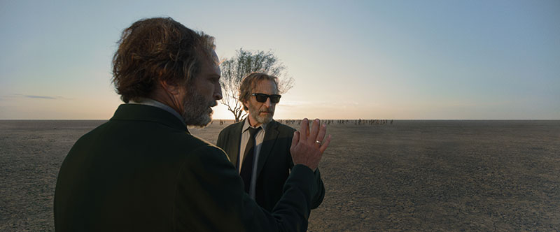
DNEG was the main VFX partner on the project, working on 880 shots from the show’s total of about 1,500 visual effects shots. DNEG’s artists, led by VFX Supervisor Aymeric Perceval, created photoreal and stylised 3D work including complex CG environments underwater, on land and at high altitude, shifting from invisible set extensions to highly visible digital enhancements and full CG environments. The team also designed and animated some of the last animals on Earth, and produced the FX, compositing and lighting needed to span the full potential of the consequences of global warming.
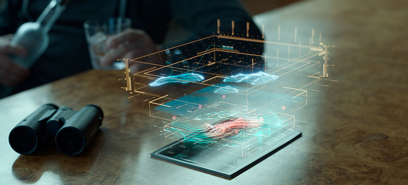
But perhaps the most distinctive side of DNEG’s work came from the company’s MGFX team, whose artists contributed motion graphics to over half of the shots delivered. Led by MGFX Supervisor Guy Hancock, their work covers holograms, video screens, medical systems and futuristic communication tools, depicting a future populated with interfaces and visual technology that have scarcely been imagined yet.

Graphics were an integral component of this project from the start. Guy said, “Our Production VFX Supervisor Ashley Bernes in particular was very keen. With its strong design focus and abstract 2D environment, it’s quite a different pursuit to classical VFX, but Ashley was engaged with the whole process, bringing lots of his own ideas and staying in constant collaboration with our team.”
No Fantasy
Ashley’s approach was the same across the project for VFX and MGFX alike, not just handing instructions and reviews down the production chain but involving DNEG in spotting sessions and asking for their ideas. Focussing on climate change meant tackling a topic of universal interest, and making VFX a participant in that discussion. The client's goal was to help people project themselves into this near future. Sci-fi and futuristic elements were a part of the plan as well, but maintaining realism and authenticity was critical to realise this vision.
According to guidelines from the creator and showrunner Scott Z Burns, the future shouldn’t feel too distant or abstract. He was looking for effects that could be used in a documentary on this subject. The evolutions in machines, animals and homes should feel researched and based on fact, and nothing should feel like fantasy.
Research was an ongoing effort for the production. Ashley brought references and imagery from current research, and held brainstorm sessions. Guy brought his own graphic artist’s sensibilities – but not to create something because it’s cool and eye-catching. Instead, it was about how the team can base its work on what is happening today. The same approach had been applied to the story development, making it easy for the viewers to relate their lives to what they were seeing on screen.
Motion Graphics at DNEG
Guy commented that having an integrated Motion Graphics team is a huge advantage, and the department is now well established within DNEG. Their pipeline and workflow is quite sturdy – which they needed to tackle a show on the scale of Extrapolations. Also, having the MGFX team operate in house with the VFX artists means they can share assets.
“This ability is unique to DNEG, made possible by carrying out our concepting and lookdev stages with VFX tools,” Guy said. “For example, we’ll use Nuke tools to create FX, even if we use other tools for the animation and design, so that when concepts are ready to pass over, minimal reverse engineering is required to fit them into the pipeline. The integration of the work from both sides makes it easier to refine looks earlier on and move ahead without the usual bottlenecks over colour workflow or sharing of assets that you have with external vendors.”
This was DNEG’s most ambitious motion graphics project so far. The MGFX team played its largest role, and also had to scale up the team further than any previous project, involving up to 30 people, which is quite large for a feature film project. But DNEG has the infrastructure and flexibility to onboard extra staff fairly readily.
Aymeric started in December 2021 although Guy had been carrying out tests for the motion graphics for some months ahead of that. Shot work began in February/March 2022, ramping up from that point for delivery at the end of 2022.
Geo-Engineering
As a reality-based project, nearly all of the VFX work was photoreal, with some notable exceptions. Episode 4 depicted a geo-engineering experiment in which calcium carbonate (CaCO3) crystals would be released into the atmosphere as a sunlight-reflecting aerosol, with the intention of cooling the Earth's atmosphere and offsetting the effects of global warming. Although such experiments are talked about now, their ultimate effect on the earth isn’t certain.
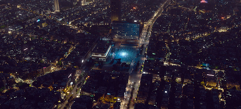
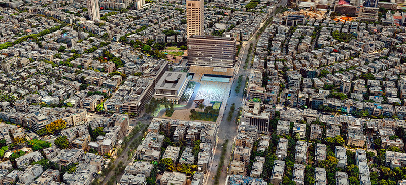
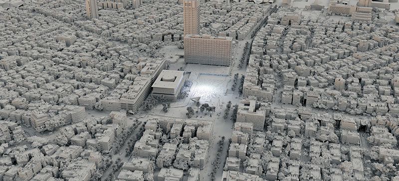
This uncertainty became another aspect of the episode’s story. “Geo-engineering projects only give you one chance. You make your calculations, follow your plan and must then cope with whatever happens,” Aymeric said. “DNEG built and sent a great fleet of drones into the atmosphere, each with a payload of calcium carbonate that would expand on release.
“We decided to visualise that expansion as clouds, adding a prism effect and diffuse lighting to suggest the effect of light bouncing in multiple directions at once. It took a lot of R&D and iteration just to decide how the event should look, while trying to give it a photoreal quality. However, since no one has ever seen such an experiment in action we had to make an educated estimation, using known light behaviour.
Friendly Winter
Episode 2 brought DNEG’s work closer to home, visiting the lives of people suffering from a heart condition exacerbated by the elevated temperatures that climate change will bring. Affected school children, like the character Ezra, need to wear small devices pinned to their clothes that remind them to stop and cool down when they are getting overheated during the day.
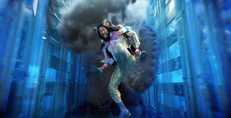
They are encouraged to connect to a video game called ‘Winterchill’ that takes them to a wintery but friendly environment where they can chill out. The special team of generalists the VFX department had put together for the series designed the Winterchill world with 3D characters and assets, giving it a cartoon-like video game ambience.

For those medical devices that are close to people’s everyday lives, an authentic feel was called for, instead of style over substance. Guy said, “Research and concepting stayed within those guidelines, looking at current medical technology and combining that with contemporary art movements and today’s design world. We would start with the practicality and functionality of those existing devices to design a believable, realistic UI, while making something attractive and interesting.”
Guy regards ‘inventing’ small consumer-type devices as another branch of world building. Ezra’s wearable device has a little monitor giving him information about the day. A 3D printer prepares his daily medicine. “The assets need functional detailing. We work with the prop, re-visit the idea and apply a creative eye to it. From a neat concept, we design an appealing visual that is always carefully balanced between sci-fi/futuristic looks and a useable device we could really envisage in use in 10 or 15 years.”
Memory Decay
Going back to Ezra and the heart-disease patients, later in their lives this disease takes a tragic turn – memories break down, become distorted and slip away. For this, Guy’s team designed a memory decay effect for the images. It combines VFX and motion graphics, based on familiar techniques of manipulating the plates to distort and move as required. “We spent a lot of time on lookdev – optical and graphical effects, blurs and distortion. How would this ‘look’ to the affected person?”
As a reference, Ashley suggested the work of painter Gerhard Richter, an artist whose work ranges between photoreal and abstract, incorporating varying amounts of both styles. From the look, they went on to showing movement within the effect, its animation, how it tracked to the body, and shifted between areas affected and not affected.
Devising a recognisable, fairly consistent look took many iterations. Because they represented a person’s memories, there were a lot of varied shots to work on, from different time periods, locations and lighting environments. They wanted to design a robust set-up, functional and useable enough to turn around lots of shots, but that plan was complicated by the need to show a progression during each shot – controlling exactly where to focus the effect, and when.
Guy said, “At first, something would not feel quite right in the image, a feeling that advanced to the end of the shot when many features and details would be missing to indicate a total loss of the patient’s control over his memory. Once the ‘recipe’ for the look was in place, our ability to work between the teams – VFX artists to graphics artists, and back again – allowed a good degree of art direction to extract emotion as we watch the memory slip away. Someone might request to show a bit more of an eye here in these frames, or less of the mouth there. This was effective for handling the memory of our character’s dead wife, which he wants desperately to hold onto, as it simply starts to crumble and escape his grasp.”
Graphics Management
Guy mentioned that it wasn’t possible to use in-camera techniques for Extrapolation’s MGFX. They were too numerous, creating time-constraints on set – setting up and capturing MGFX in-camera is time-consuming – and the production had to keep moving between a number of locations. Further, many of the graphics appear on non-standard screens and even floating or transparent screens. There was no fleet of suitable monitors they could quickly install on the sets for playback.
Also, throughout the project, the script was being continuously adjusted to reflect the production’s better understanding of the topics at hand – documented climate change, ongoing technical developments and scientific discoveries. They needed the flexibility on-set to re-shoot or re-conceive a segment, and know that they could make last minute changes to the graphics later in post.
Fellow Creatures
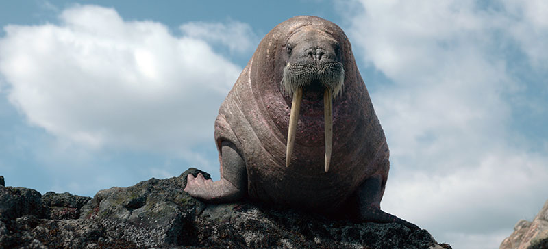
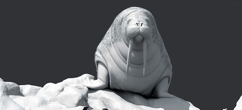
DNEG’s 3D team needed to create and animate several different animals whose lives are affected by the themes in the show. Given the realism the production wanted to achieve at all times, the well-established creature team and pipeline were in demand. But Aymeric also said, “For Ashley Bernes it was critical to prevent over-animating the creatures. Despite the key story points they helped to illustrate, those animals needed the same realism they would display in a documentary program.
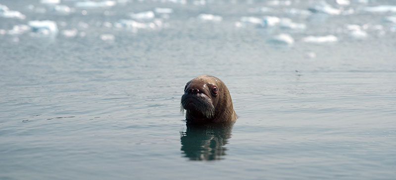
“In one sequence, a walrus attacks and kills a person, in another, a whale is conversing in real time with a human character. But the brief was to strictly avoid emotionally enhanced performances. The walrus’ jump had to match a real, natural jump and not be invented. The human-to-whale eyelines needed to feel more static and objective. Cuteness was especially off the agenda, even for baby animals.”
Time and Place
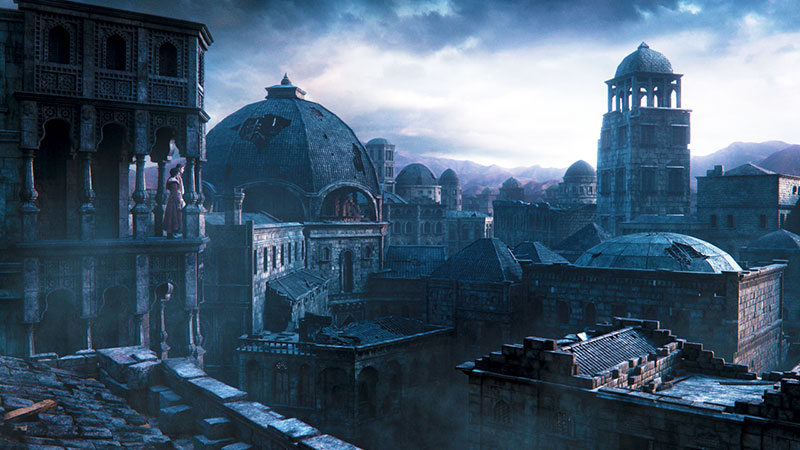
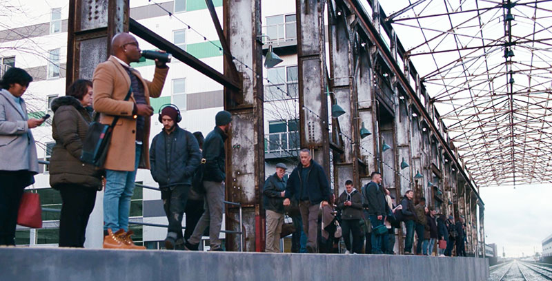
The shoot took place mainly in New York City and around the state of New York. Those locations then had to be transformed into the many locations in the episodes ranging from Franz Josef Land at the Arctic Circle to Tel Aviv and Djibouti to the London Underground. Most of them needed to be instantly recognisable to audiences, requiring further research to create invisible set extensions.
But these places also needed to feature both futuristic elements, such as advertising or holograms serving different functions, and evidence of the encroaching effects of climate change, to fit them naturally into the story. These additions increased as the series progresses through the decades.
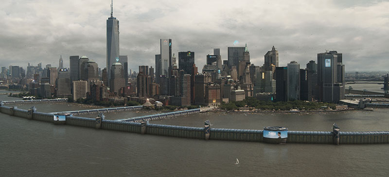
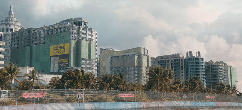
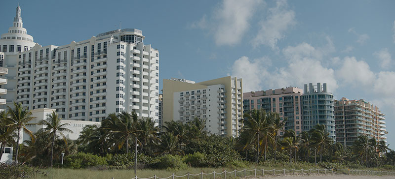
One of the more extreme environment enhancements was the flooding in Miami. 2D, 2.5D and 3D elements were composited into plates to show the damage, flooded buildings and other effects of multiple flooding events Miami experiences over the years and how this has become the new way of life for residents. Seawall construction sites are some of the associated, highly visible 3D work the team added to several of these sequences. Their look is based on the delta works in Amsterdam to enhance their realism and grounded feeling.
Graphics in Public
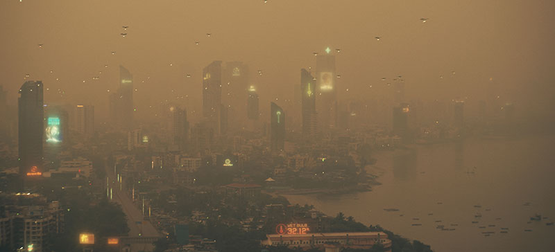
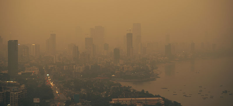
Public graphics and advertising were added to the frequent panoramic cityscape shots. Across Mumbai, San Francisco and New York City, these kinds of elements couldn’t be consistent for every place and time period. They helped to reflect differences in urbanisation, passing time and also cultural contrasts. In Mumbai we see graphics in both Hindi and English with a distinctive Indian colour palette.
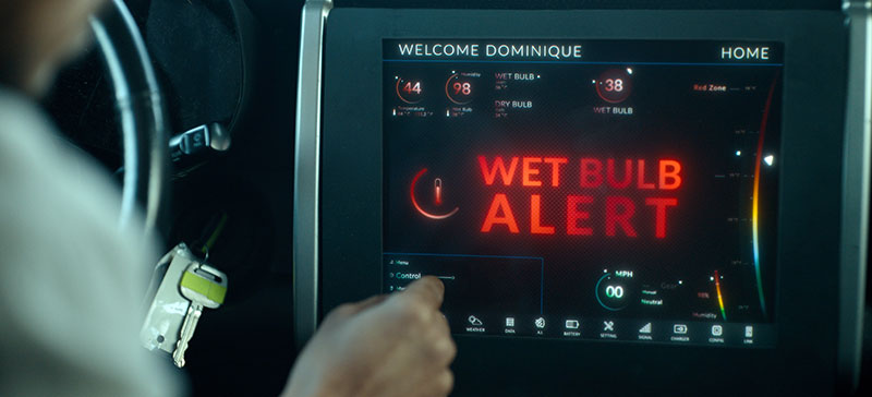
Public service graphics helped tell the story alongside dialogue. An example is a ‘wet-bulb’ widget that indicates when temperatures have risen too high for heat sensitive individuals to go out. It estimates the expected heat stress on the human body when people go out into direct sunlight by taking the combined effect of temperature, relative humidity, wind speed and solar radiation into consideration. A few years ago, such information wouldn’t have seemed relevant to many people but now it is a key health indicator throughout Asia and Africa and needs to be publicly accessible.
Everyday Holograms
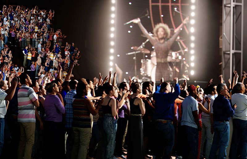
Holograms are another example of motion graphics that clearly evolve and become more sophisticated over time as the episodes proceed. The brief for the holograms was wide-ranging because Ashley wanted to show not only their technological evolution but also the changes in who can afford to use such tools to put out their message and perform the necessary function.
Initially, holograms are mainly tools for the scientific community. Then later on, military and political users developed their own applications. Still later, highly realistic holograms appear, used in mainstream applications. Guy said, “Evolution was a feature of all our graphics for the show. We had a time span of 30 or 40 years to cover here, and had to make sure the graphics kept up.
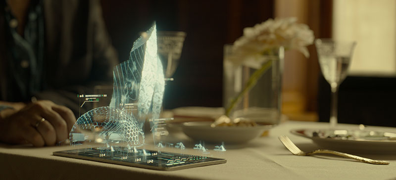
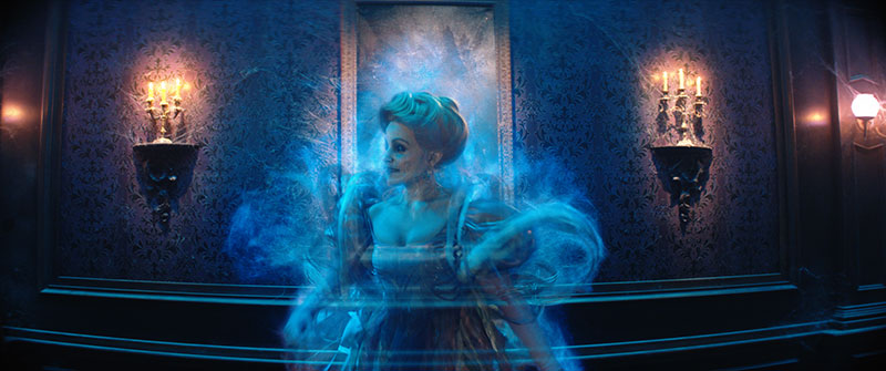
“Hologram lookdev started with existing examples as inspiration. We introduced enough glitches and imperfections to remind the audience of exactly what they are seeing. Then we figured out what the next improvements would be – say a diffuse light source with an adjustment for opacity. Then we experimented with making them realistic enough to fool people – who is real or not real?
Most of the holograms were produced through a 2.5D workflow using shot footage with different treatments for looks, using them within a 2.5D space to give them the feeling of a 3D object. However, a tiger hologram was based on a 3D model, giving the CG artists more to work with. They also took the different hologram source points in the story into consideration – one is displayed via an old-fashioned pocket watch, another has a hologram frame. The US president is seen conversing with a military general. The team also played with messaging filters for people to use on their devices. A mother chats with her son while using a filter of a unicorn’s face.
Out of the Blue
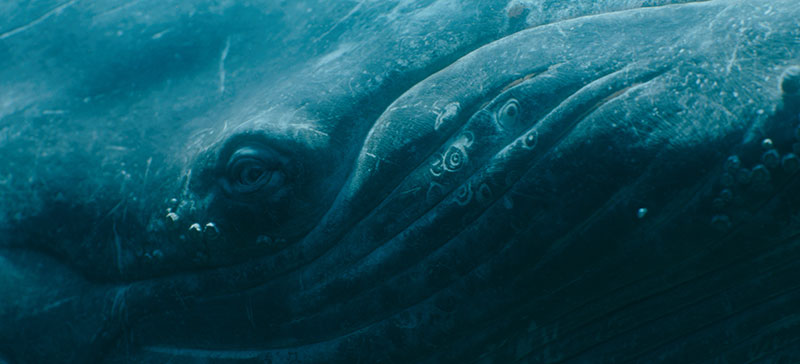
The underwater world of the second episode was a major CG environment, seen through the massive glass windows of an underwater laboratory off the South American coast. This is the location of the marine biologist Rebecca Shearer’s conversations with a humpback whale. She flies out to the rig housing the laboratory, used as a listening station for communicating with the whales. The rig itself was a full 3D build and included two sets, one positioned above the other.
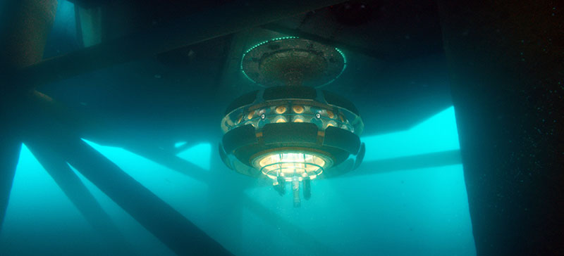
Aymeric said, “The surrounding underwater world, seen at whale-level through the windows, was a good challenge because such an environment can easily become little more than a nice looking blue colour ramp, and that was what we wanted to avoid. Both the showrunner and Ashley wanted to look into the background and see depth and features. The presence of the whale helped, of course, but shots without the whale needed bubbles, marine snow, lighting and compositing effects, requiring a complex, combined effort.
“Teams from across the company, FX to lighting, came on board with ideas to ensure they ended up with much more than a blue ramp to look at. FX managed all particle elements, lighting devised a beautiful system of godrays that they stylised to balance realism, story lighting and distance. Then the compositors pulled everything together, and added attractive animated shapes to increase the layered effect. The result is beautiful and looks photoreal but is in fact entirely digital – in other words, it is cinematically real. It visualises everything we understand and think as humans about such a place, and is satisfying in that way. But in reality, no place like it exists.”
Inside the Lab
The work Guy’s team carried out for this laboratory involved a more specific kind of storytelling. Inside the lab, the characters were surrounded by the huge glass windows and technical research equipment dedicated to monitoring sea temperatures, chemical constituents and sound.
The main feature was a communications device that supports responsive interaction with the whale by converting whale and human speech back and forth in real time. A widget was shown detecting and exposing patterns of speech visually, as they emerge and come together. The graphic displays for these devices and programs are linked across the windows with lines of connectivity to show that they were all part of a coherent system.
The console operating at the centre, however, retained a retro look despite its novel application. The artists wanted to present these capabilities mixed into a more familiar hardware environment to give the sequence an authentic feeling and also to avoid distracting viewers with shiny, mysterious new devices. “This sequence was critical for our story. The character’s ability to communicate directly with a whale – THAT was the important point we wanted viewers to focus on. The equipment was there to complement the action,” Guy said.
They worked with the sound stems, which are groups of specific sounds mixed together, to make sure they were using the correct vocals to generate each visualisation and correctly activate the waveforms. www.dneg.com
Words: Adriene Hurst, Editor
Image Courtesy of DNEG © 2023 Apple Inc.


