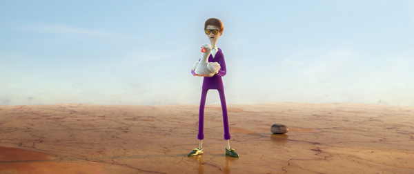
Visual content studio Coffee & TV worked with agency McCann Velocity to produce a 3D animated short for the latest Vauxhall campaign. As the dedicated, specialist agency created for Vauxhall Motors by McCann Worldgroup, McCann Velocity wrote an original script that brings the famous ‘Jack and the Beanstalk’ fairy tale up-to-date by telling it backwards.
The project highlights the benefits of Vauxhall’s reverse camera functionality, and is one of three ‘Backwards Stories’, an international series of three 50-second films for Vauxhall in which Cinderella and The Ugly Duckling are also recreated.

Coffee & TV’s VFX and Animation Lead, Martin Allan was responsible for storyboarding, character development and pre-vis. Jonny Grew, Senior CG Artist, directed and led the project, starting with traditional fairy tale book-style animation with some surprising contemporary elements. Jonny said, “The nice thing about this project was the creative freedom Velocity gave us to explore our ideas. The voice over was the only real constraint.
“We crafted a 3D world that stylistically follows the traditional illustrative fairytale book-style, but with a modern look. A lot of time was spent storyboarding and developing character looks. The goose, Jack’s mum, the giant, adult and baby Jack, were all subjected to multiple experiments with different features and clothing. The team agreed the main character’s designs should lean toward a cartoon-like, traditional squash and stretch movement. We were keen to push the proportions of the characters beyond reality in order to give the piece a quirky style – for example, Jack is gangly and thin and his mother is a squat dome of a woman.”
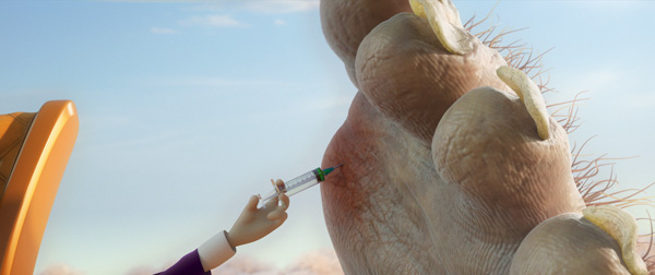
The colour palette helps tell the backwards fairy tale. Happier scenes were accentuated with beautiful and light tones in contrast to other sections of the film which were greyer and dank, inspired by the images of the Great Depression.
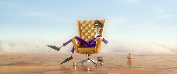
Josh George, Senior CG Artist and Animator was responsible for development and design of sets, props and, especially, the characters. After sketching initial ideas, Josh sculpted and m,odelled figures in ZBrush, finessing details and textures including hair, skin, feathers and shaders. The sequence was brought to life by a team of animators including Catherine Elvidge, Amy Heyes, Jonny and Martin Allan. The script was originally a radio commercial, and starts off slowly but quickly moves to a fast pace, so they wanted to reflect this in the animation.
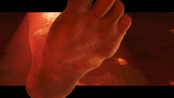
“Pauses were added at the beginning to let some character actions breathe naturally but it was important for the animation to become snappier when the audio gathers pace once things start to go wrong for the first Jack character, ‘Rich Jack’” Jonny said. “The edit reflects this and uses crash zooms, hard cuts and seamless camera transitions. It also breaks the letter-box with the goose and giant's foot to amplify the impact of height and scale.”
In order for Jack to squash and stretch beyond the bounds of reality, an elastic bone set-up was created. A volume preservation element was also added to allow the team to make him skinny when stretched and squat when compressed. All the characters, sets and props were modelled and sculpted with ZBrush. Complex detailing and textures were introduced to each element and sequence before being brought to life by animators. Particular attention was given to skin, fabric, feathers, clouds and vegetation, all crafted and finessed by hand.
Jack and his mum’s face were rigged to give control and manipulate expressions required for the story, while all of the goose’s expressions came from scaling its eyes and extreme squash and stretch poses. Jonny said, “Certainly having bulbous eyes means that it was easier to create emotion by rotating the eyelids inward for angry expressions and outwards to portray worry.
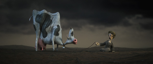
“We wanted to make sure the characters were tied together visually and were part of the same world, but the square cow was a bit different. Over-characterising the cow and making it square created a curious pause in the film. Considering it’s such a fleeting moment we have been delighted by how many people have responded to the cow’s appearance and found it really funny.”
Look development, lighting and rendering was completed by Adam Lindsey and Adrian Russell. Other crucial elements, including explosions, destruction of rock and animating complex movements of the characters' clothing, were produced in Houdini by Richard Costin. While they wanted to create a traditional fairytale-style look, they also wanted to add some specific elements of reality to the film. “We wanted the dust effects, clothing, and the cracking floor to stand out as the only elements with a realistic appearance. Therefore, Houdini was the best software to achieve the simulated effects,” Jonny said.
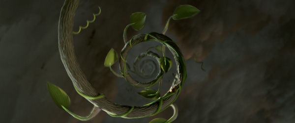
The beanstalk, however, as an important story point was handled in a more magical way. The initial look was inspired by the classic Fibonacci Spiral. The spiral curve was used to deform a pre-sculpted straight beanstalk which retracted and shrank in diameter. Embellishments of leaves and bean tendrils were animated and pinned to the stalk. The displacement of the beanstalk diminished as it got younger and the colour was adjusted on the way down to run from a mature, gnarly, lurid tone to a smooth green, young shoot.
Art direction and compositing was crafted by Steve Waugh, Coffee & TV’s Head of Design. His work, completed in Adobe After Effects, bonded certain camera moves to form continuous, uninterrupted transitions within the film, in effect creating a single sequence.
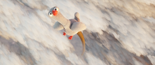
Certain elements were used to transition from different sets, for example, the tin can hitting Jack’s mum’s caravan door, moved from Jack and the cow to triggering her appearance and the birth of baby Jack. The use of clouds also created a blend between worlds in the goose section, making the goose appear to end up a lot higher than it actually did.
Jonny said, “As mentioned earlier, the use of colour to tell the story was key. Careful use of a shifting colour palette defines the evolving mood. We started out with a light and airy palette, before moving into richer gold tones, then to a scarier section influenced by reds, and finishing with grey and depressing tones. Steve Waugh enhanced the colour theme during the compositing phase before the film was graded in DaVinci Resolve.
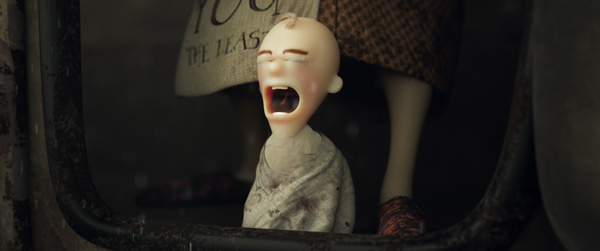
“Some photographs were used for texture reference, but everything was hand-crafted using Substance Painter for all textures. The clouds were generated by brush strokes, instanced onto particles using Mash in Maya. Arnold Subsurface was used to create realistic skin and the beanstalk, drawing these elements back to reality. A significant factor in the final look was the complementary lighting to ensure that we had a balance in light and shade. For example, the gnarly beanstalk displacement wouldn’t have been so apparent with flat tones, so a combination of texturing and lighting brought out detail.
Coffee & TV’s colourist George Neave, working hand in glove with the studio’s animators, further enhanced and finished the spot. www.coffeeand.tv


