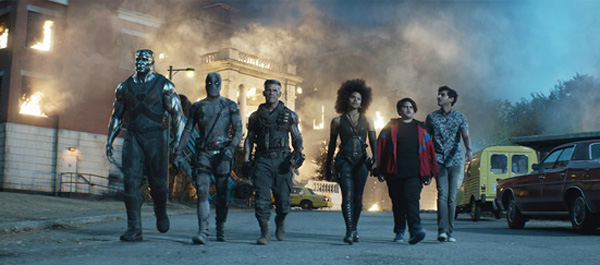
When Marvel's mercenary superhero Deadpool must protect a young boy with supernatural powers from the dangerous, time-travelling cyborg Cable, he assembles a team of mutants to help. The results are exciting, chaotic and funny. The VFX vendors involved in 'Deadpool 2' had the chance to work out creative solutions to interesting challenges ranging from character animation and effects to environmental work and 3D simulations – all while keeping their sense of humour. Digital Media World spoke to Framestore and Method Studios about their work.
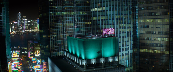
Method Studios worked on about 300 VFX shots for 'Deadpool 2'. In a high-action, fast-cutting montage early in the film, we see various villains getting their just deserts. Method's artists augmented the scenes with stylised gore, and invisibly composited together the sequence between the criminal's locations, ranging from a bathhouse, strip club and meth lab to a mob boss' funeral. Director David Leitch captured as much as possible on set before Method digitally blended the plates with 3D elements.
“David is very practically-driven and wanted to shoot as much as possible in camera. This approach is great for us because it establishes a realistic baseline for how elements should look in the environment. A lot of the harder tasks are resolved before we begin so we can focus on refinement and more creative-driven work,” said Method VFX supervisor Sean Konrad.
Live Compositing
Because the live action material was going to be critical for the sequence, the production VFX supervisor Dan Glass took a similar approach by shooting the plates meticulously - planning the shoots based on the angle of the sun, syncing movements on set and setting up guideline markers, which gave the artists a sound start point.
Sean Konrad was on set for many of these shoots, at times creating live composites between takes to make sure the action was in sync. “Near live is a more correct descriptor,” Sean said about his work on set. “The video village team would dump a USB drive to me of the camera output and then I'd do the compositing in Nuke. I could usually render out a Quicktime in between resets on takes. While the production would just use use an Add Overlay view on the monitors as an initial check, our composites gave us a chance to scrub through and zoom into certain areas, and we noticed a couple of minor anomalies right away.”
Then afterwards in post, the compositing supervisor Andrew Brooks and his team refined the final looks. They would re-time the plates to help align the movements slightly better, as well as slide the foreground element around horizontally so that it avoided certain obstacles in the background take.
Out of Phase
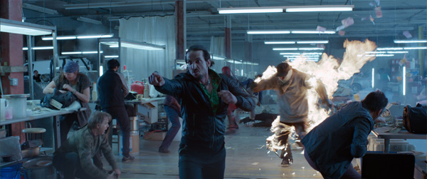
Sean noted that the montage scenes in the meth lab were especially fun to shoot. “The fight choreography is actually really complicated, and it was cool to see the performance in action,”he said. “Using motion control, the cameras were set up with the foreground camera running at a higher frame rate, 96 fps, and the background in real-time, so that we would be able to create a discord between different pieces of the action.”
The intention was to create an out of phase shot in which the meth boss character in the foreground is in slow motion and the background is real time, but both elements still visually hang together. Ultimately, Sean said the real purpose of the shot comes from the director - after watching the movie, he suddenly realised how this effect functionally serves the story.
“Shortly after this scene, Vanessa is killed by the meth boss in a dramatic moment, but viewers haven't seen much of this character before, and so it's important to establish him as an antagonist before that pivotal scene happens,” he said. “This shot, through its structure and narration, informs the audience that this guy is trouble and has reason to go after Wade.
“Because the opening sequence races relentlessly forward, it's important to keep the pace and energy in the scene that follows. In other words, a director can't suddenly shift into super slow motion while the soundtrack and momentum continue rushing ahead, without jolting the audience. The shot keeps the villain in focus for the audience while total mayhem is happening behind him, and transitions the story out of the montage sequence.
“David is known for this kind of long, elaborate action shot. It's part of his style and what makes him a vital filmmaker. I think that the choices made for this shot - and many others - helps to give the film a distinct voice that isn't always apparent in superhero movies.”
Cable's Arm
About a third of Method’s shots take place in the prison set, where an anti-mutant paramilitary group is holding Deadpool. Production built a good-sized physical set in an old warehouse in Vancouver that the artists augmented with CG smoke and dust, led by Method’s digital FX supervisor Sean Schur. For authenticity throughout this space, they maintained a consistent look and glow for the flashing red lights, enhanced the explosions and scattered CG glass shards.
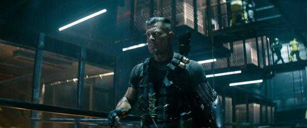
They also created Cable’s robotic arm for these shots, which proved a complex challenge. Sean took time to explain the process in detail. The bulk of the arm work in the rest of the film was handled by Double Negative, who supplied extremely useful reference from the outset, and their rigging team volunteered a lot of information. “It was a level of collaboration that we don't normally get,” Sean said. “Their VFX supervisor Mike Brazelton and I kept in touch throughout the show to make sure we weren't creating totally different characters.”
Method Studios has a fair amount of their own robotic character experience to bring to 'Deadpool 2', both from advertising and feature film projects. Early in the shoot, Sean brought one of their animation supervisors Steve Clee out to set. Steve had worked on set with mechanical limbs on other films, such as 'Okja', which Dan Glass often referred to for help developing realistic contact and interactivity with CG characters.
They also recalled the way Colossus' musculature moves and responds to concussive blows, and tried to make those ideas work for Cable's arm. Sean said, “You'll see in close up shots that the forearm guide plate slides forward and recoils, which we based on how muscle and fat will slide, but we tried to keep the movement rigid so that it still felt robotic. The plates never bend, but they can slide and move organically.” Having enough control to do that relied on accurately tracking every detail of the live action.
Mocap and Matchmove
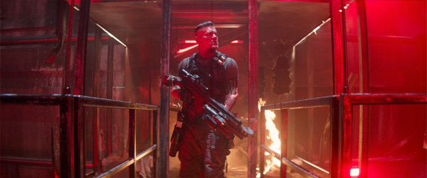
On set, the actor wore a motion capture sleeve. The VFX team typically shot him with witness cameras from two angles, at times using three angles if he was contacting something. Unfortunately, as they weren't on a calibrated motion capture stage, automation wasn't a real option. Consequently, they used traditional matchmoving with sculpting on top to better emulate how the actor's muscles flexed.
The mocap sleeve was a great help, printed with large triangles to view at a distance, plus smaller ones for close up work. “However, at one point we were looking through the camera and noticed that the fingers weren't picking up well in our darkly lit prison environment, so the costuming department supplied some retro reflective dots for the glove and a green glove that fit underneath for the fingers, which really popped against the greys,” said Sean.
“We also sewed in a strip of green against his grey T-shirt so that the sleeve line was always distinct, even in motion blur. Costuming was incredibly helpful and offered a lot of ideas that we tested on the shoot day, and settled on a solution that worked pretty well.”
The connection with the sleeve was the challenge, as the actor's biceps are huge and constantly change shape. Aligning the rigid robotic hoses at the top of the arm wasn't simple, and judging the volume of the muscles under the shirt was tough, even with witness cameras. Sean said, “The compositors created simple masks for the matchmove team and animators, allowing them to see in the viewport how the sleeve was moving, but we also wanted some slide in hero shots. It sometimes just involved a lot of eyeballing and we relied heavily on our animation team's endurance and patience.”
Colossus
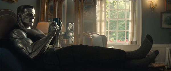
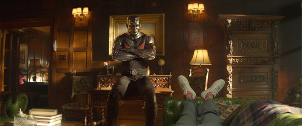
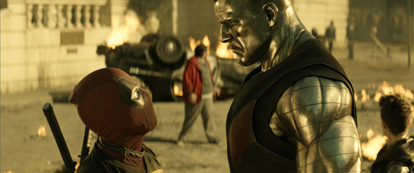
Several of Method’s shots centre on Deadpool’s interaction with Colossus at the X-Mansion, where the work was overseen by Method Animation supervisor Alex Poei. Owing to the character's reflective surface, lighting Colossus for this performance-driven sequence proved challenging. The team painted HDRI domes to create interesting highlights and also softened his facial expression. Designing long, broad movements in the face helped to convey the appropriate metal texture while also hitting empathetic beats during performances.
Sean said, “Sometimes the on set lighting did complement Colossus extremely well. When that happened all we had to do was place the dome light correctly. In other cases where he was reflecting a wall or something uninteresting and the results looked a little dull, we could rotate the domes until we got a pleasant reflection, or even paint highlights or throw in softbox lights to fill up an area.
“It was extremely easy to get completely blown out and flat, so we would attenuate the highlights and push range if necessary. Conversely if the HDRI lacked energy, he'd start to look a bit dusty, so we'd split out the key or sun and crank that until it looked nice again.”
The Afterlife
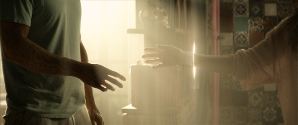
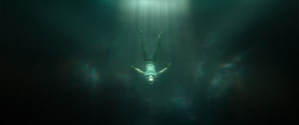
A recurring theme in the movie is Deadpool’s attempt to reach the afterlife to rejoin his murdered girlfriend, Vanessa. Repeatedly, he finds himself arriving at a limbo state instead, rather like a void, for which Method developed a special look in the footage. They also visualised the transparent barrier that keeps him from finally crossing over. The artists expanded on concept art that the senior art director at their LA office, Philippe Gaulier, created for these looks while collaborating with Dan Glass.
Sean described the void as a 3D environment, mostly built in Nuke and using a mix of particle simulation, 2D fluid simulation, photographed elements and distorted geometry rendered with Nuke's V-Ray plugin. “We used reference images from Philippe, who has worked with Dan Glass for years and knows what's in his head. We pulled a lot of ideas from deep sea photography, as well as music videos and other films.
“The void has a distinct, cold colour palette while the apartment is warm and sepia-toned, mostly captured in camera. In one shot when we see the void and the apartment in the same frame, we tried to make sure that warmth is still apparent. We avoided warmth with any elements in the void shots, but kept Wade a bit separated so that it wasn't entirely monochromatic.”
Comic Book Heroes
With a long list of comic book movies already behind them, Framestore enthusiastically took on 229 shots for 'Deadpool 2', working on the movie's two main CG characters, Colossus and Juggernaut. Their team supplied further VFX and animation work especially in the finale sequence, the movie's showstopper, which includes 120 shots composed almost entirely of CG elements.
Framestore’s VFX supervisor Stéphane Nazé was on set at various times across two months of the shoot. "It’s always good to go onsite to immerse yourself in the aesthetics of the location. Even if you have images, nothing can replace your own experience or the information collected by actually being there. In this case it was also critical to finalise which parts of the set were live and which would consist of set extensions,” he said.
"The bulk of our work was for the final fight in the film, during the third act, and on-set supervision was crucial to make the plates for the sequence more useful. For this film in particular, it was important for us to be on set because we were in charge of all the CG creatures.”
Unstoppable
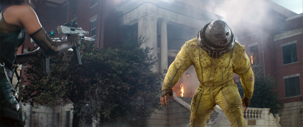
Framestore’s Art Department worked on initial concepts for the Juggernaut, who has appeared in other films and the comic books, although not the Deadpool series. He had only been seen in a single frame of the trailer, which Stéphane said was a deliberate choice to keep the fans wondering how he would look and how big his role would be.
Giving him the correct sense of scale was a primary challenge. The Juggernaut's presence as a huge, unstoppable force determined how the team handled the animation. To create a weighty enough feeling for his body the animators delayed the initiation of his moves into action. "But once he’s in motion he’s surprisingly fast,” said Bernd Angerer, animation supervisor. “Working out the insane power of his punches in the final battle was a fun challenge.”
'Deadpool 2' presented the animators with an unusual combination of demands for a character like the Juggernaut – expressing violence and power with comedy, fantasy, realism and fun. Bernd said, "Juggernaut was a very interesting character to develop animation-wise. We started by developing ideas around who and what he is. Much of the animation style is defined by his costume. Throughout our sequences he wears a helmet and a very heavy collar, which severely restricts his head movements and shoulders, and leads to a very distinctive way of looking or turning around.
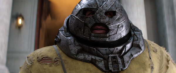
"In fact, almost all of his movements come from the spine instead of the neck. We left a little bit of freedom for his head inside the helmet but he was mostly restricted, which also added to the story about his character being imprisoned. Juggernaut's prison restraints also made it technically very tricky for us to raise his arms above his shoulders. Even his range when moving forwards was very restricted. This, again, was solved by building the arm swings and punches coming from his chest.
“Another challenge was his facial expression. The helmet concealed most of his face, but left enough space to feel his presence, enabling us to almost exaggerate his expressions. More specifically, he speaks with big mouth shapes, and each facial reaction, be it from his eyes or mouth, need to be easily read.”
Splitting Steel and Skin
Colossus, in contrast, is beautiful - and a favourite of the fans from the first 'Deadpool' film. Despite his steely looks he is kind, endlessly patient, magnanimous and able to transform his body tissue into an organic, steel-like substance that gives him his superhuman strength. Framestore's task was to adapt him for the sequel, and develop their own way to handle the contradiction between metal and skin.
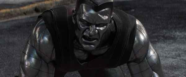
“With Colossus, we wanted to keep the face from the first movie, but we changed everything else about him,” said Stéphane. "Colossus has always been a full-CG character, but we re-created him with each line between his muscles splitting the geometry. A lot of time was taken to focus on the rigging and muscle deformation. We used the gaps between the lines to compress the different volumes to help compromise between the flexibility of his skin, and the rigidity of metal."
Colossus' performance as seen in the movie is a combined effort, starting on set with a stand-in performer who was used to find the framing and to pace the action. This performer wears a 'helmet' that extends vertically to the height of the CG character with markers such as grip tapes to locate the eyes, and another marker to indicate the top of the head. This gives the other actors something solid to look at on set for proper eye lines.
Framestore then set up three motion capture sessions with a stunt performer and, finally, the performance of the actor who voices Colossus, Stefan Kapicic, recorded a facial capture session to pull data that was used as reference for keyframe animation and also to ground the performance.
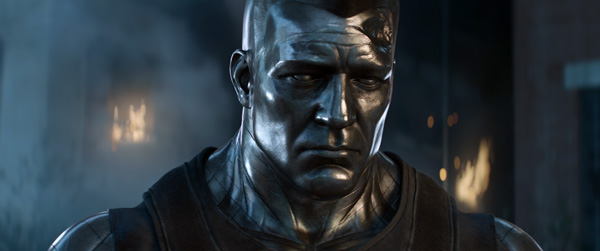
Nevertheless, animating a large, solid, rigid character involved some experimentation. "We tried more natural human behaviour through to very stiff, almost statuesque poses,” Bernd said. “Eventually, we struck a good balance between creating him as a tall, tense authority that barely moves at some moments, and a fierce, athletic fighter with a surprising range of motion and expressiveness in others.”
Stoic
Method Studios, who worked on sections of his facial animation, found that Stefan Kapicic's performance often diverges from what was desired for the character, with lots of gestures and an expressive face, whereas Colossus is meant to be stern and stoic. But Sean Konrad remarked that when he was at the initial facial capture sessions, he liked many aspects of his Stefan's performance.
“He had little ticks that I thought could ground the character. Every time he would say 'no' or 'never', he would shake his head a little before he said the word. Colossus doesn't blink or close his eyes, but he can narrow his eyelids, and move his eyebrows, so we borrowed Stafan's timing and incorporated it into the permitted moves. We also found that if we slowed those ticks down they worked better.”
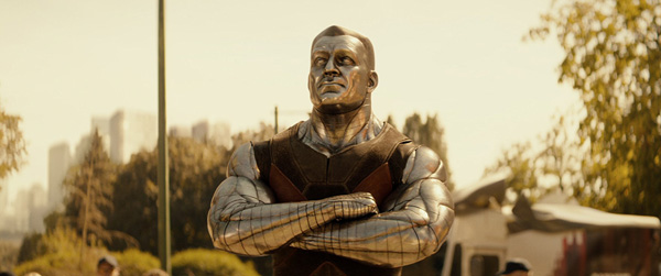
By the end, Method's facial animation lead Andrew Park had harmonised much of Colossus' range of motion and would provide reference loosely based on Stefan's performance as well as the target. The animation teams relied heavily on reference and explored variations on the captured motion in shots - it was extremely valuable for getting to the heart of the character.
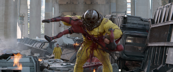
Deadpool, who can regenerate damaged or destroyed areas of his cellular structure much faster than an ordinary human can, frustrates the Juggernaut's efforts to kill him by tearing him in half. The incident required the team to build a high-resolution digital double of Deadpool with more creativity than usual.
With the insides of Deadpool’s torso exposed, trial and error across several teams was necessary to get the look of the sequence right. The assets and FX departments dealt with the entrails and gore, and the Creature FX artists focussed on cloth simulation of Deadpool’s clothes. CG Supervisor Ben Magana said, “Although we had to make an impact and gross the audience out, we didn’t want to push that too far. It was a case of making it look over-the-top, so that it didn’t seem too realistic but was still very funny.’
Showdown
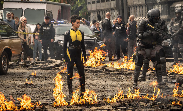
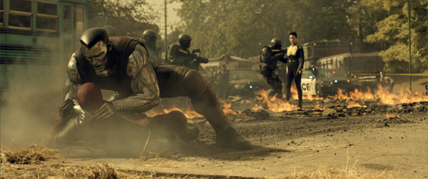
Framestore joined the huge battle between the hero characters that serves as an epic finale to the film. “Deadpool actually says, 'Big CG fight coming'”, said Ben. “So, the audience expects something big now - we have to deliver it!” The last act became a mostly CG sequence, with a tight timeframe for shot delivery, and the team had many of their own ideas for it. A hospital was used as the environment in plates shot on set, but the decision was quickly made to build a CG environment to interact more accurately with the huge amount of action taking place.”
The team got to work creating the main building, surrounded by trees, a swimming pool, gymnasium, and playground in CG. Digital doubles of characters, including Deadpool, Cable, Domino and Negasonic, were used at key moments. Furthermore, a large, sweeping fire is raging. The client also wanted to feel the night was coming, so we had to play with the light as we worked, starting with a late afternoon mood and ending at dusk, which was a major compositing and look development challenge.
With so many aspects of this sequence under their control, forward planning was critical. Stephene also said, “The shots for the final battle were especially important to map out because two sets of action were unfolding in parallel - what was happening at the exterior of the orphanage, and what was happening in its interior. This presented a complexity because of the time running out between both scenes. Framestore worked on character and choreography development while The Third Floor visualisation studio executed the previsualisation of the final act.
“In the sequence montage, a few key elements relied on the plates, and we needed to connect these key shots in 3D. Meanwhile it's important to remember that 80 percent of the final battle sequence is full CG. As the final battle sequence was locked further down in the filmmaking process, previz was a crucial element in order to be proactive and establish timing during the montage. In fact, while The Third Floor was working on previz, we were simultaneously setting up animation plans."
Power and Light
Compositing supervisor Romain Rico said, “We defined several stages of fire and smoke and then created a 3D setup that we could populate into the shots and update easily.” They collaborated closely with the client to define the look and timing for each of four stages. These definitions included elements such as the amount of broken glass, quantity of fire, flames and smoke, and so on.
“Having these references for each stage was very helpful for the compositors to match their work to, accordingly. For example, the sweeping fire is in 2D to allow the compositors greater control over the amount of flames, fire, smoke and their speed. Also, in order to manage the progression of these different elements throughout the shots, 2D was the best solution,” said Stéphane.
“During the shoot the production of flames hadn't been defined yet, and in order to keep as much control as possible, all the light interactions were created in post. While some shots are live, with windows actually set on fire, all of the interactive lights were added and created in 2D.”
The afternoon-into-dusk scenario required close collaboration, working back and forth, between the look-development and compositing teams to establish a cohesive, neutral lighting. This, in turn, allowed the compositors more freedom in determining the range and value of the lighting to effectively communicate the day’s progression from dusk to night.
Finally, Framestore's animation work established for Juggernaut and Colossus was now put to the test as well, as the two characters battle it out for victory. The animators used reference of boxing and wrestling matches to inspire the moves. “The problem we had was that both characters are indestructible,” Bernd said. “How do we make the assaults bigger and bigger? Working out these actions for maximum impact was both fun and a challenge.”
Words: Adriene Hurst
Images: Courtesy of Marvel and 20th Century Fox


