Colourist Natalia Raguseo talks about the tools she used in Resolve to build the look from the natural lighting and landscapes recorded on location, working with the director and DP.
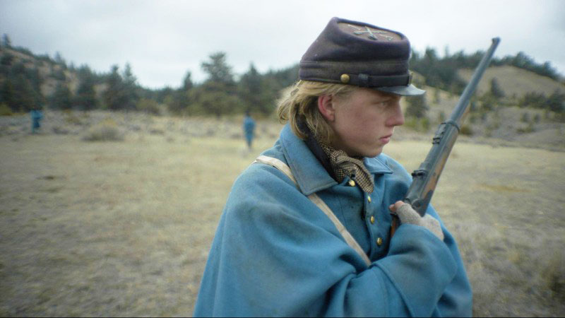
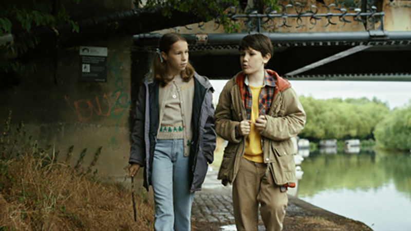
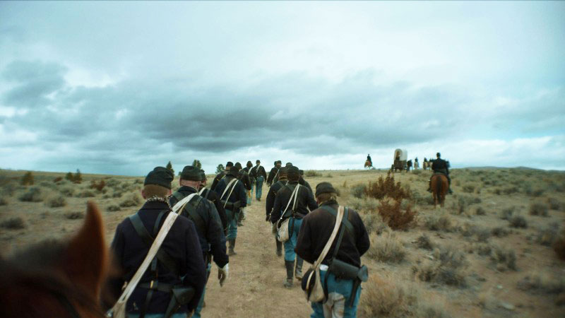
A new project from director and writer Roberto Minervini, titled The Damned, is set in 1862 during the American Civil War, following a platoon of Union soldiers patrolling the western front. Their faith, hope and purpose are harshly tested as winter sets in and no end to the conflict is in sight.
The cinematographer Carlos Alfonso Corral and Natalia Raguseo, colourist at Imago VFX in Turin, Italy, worked together to create the film's visual style. With a background in both classical painting and digital media, Natalia graded and finished the film with Imago VFX CEO Fabrizio Nastasi overseeing the film’s mastering.
Shot on the ALEXA Mini LF, a large format digital cinema camera and vintage TLS Canon Rangefinder prime lenses, the director and DP used careful composition, a slow narrative pace to highlight the soldiers' long waits, and many close ups of the actors’ faces to visualise their story. Wide angle lenses and the bokeh from the vintage optics emphasize the characters' expressions, creating an immersive atmosphere focussed on their inner struggles rather than the war itself.
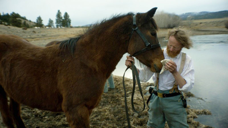
The Damned premiered at the 2024 Cannes Film Festival in the Un Certain Regard section, where it won in the Best Director category. It also screened at the 49th annual Toronto International Film Festival.
Inner Story
“Wanting audiences to empathize with the protagonist’s inner turmoil, we opted for a natural colour palette for the film, with cool tones to reflect the inhospitable nature of the setting and convey a raw visual experience,” said Natalia. She worked on the film in DaVinci Resolve Studio.
“Using primary and secondary colour correction tools, including colour warper and curves, I refined the natural tones to create a distinctive visual effect that increased the sense of anguish. We also emphasised an impenetrable feeling in the surroundings, where the enemy is ever present but unseen, and took advantage of the lenses’ dreamlike bokeh.”
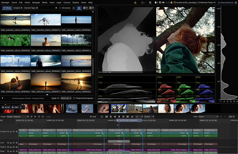
The curves are used to define the colour and contrast of an image in detail. Each curve adjusts a region of the image based on hue, luminance or saturation. Using the default custom curves, you can adjust red, green, blue and luminance curves independently, displaying a live histogram alongside as a guide. With the colour warper you can then set a hue vs hue colour grade for specific saturations, or warp colour based on luminance or brightness.
Natural Light
Historical accuracy and realism were central to the director Roberto Minervini's vision and led to the exclusive use of natural light. When shooting at dawn and dusk, its constantly shifting colour, intensity and direction gives the film an authentic feeling. The lighting choices were not only for visual continuity but were a deliberate artistic decision to emphasize the natural fluctuations in light over time.
Natalia describes an ambush scene as an example of the artistic use of natural light. “Shot over 15 days, the scene captures the beauty of blue hour,” she said. “Through the grade, I visually defined the light’s progression, culminating in the night’s deep, unsettling darkness.”
"I monitored the colour and exposure carefully, using DaVinci Resolve's printer lights, and the magic mask tool allowed me to isolate and adjust specific elements within the scene, enhancing its its ability to evoke emotion,” Natalia noted. Resolve’s printer lights adjust the RGB channels in fixed, linear increments, simulating the traditional film colour timing process.
The Colour of Snow
Natalia also described the final snow scene, one of her favourites. “Set in the Montana desert, it shows a military unit splitting up, ending in a poignant moment between the two protagonists who pause in a melancholic, snowy landscape, gazing upwards as snowflakes gently fall on their faces.”
Colour grading the snowy scene was a challenge, as snow reflects the environment with subtle variations in colour. “The use of vintage lenses added to the complexity, introducing unique reflections,” she said.
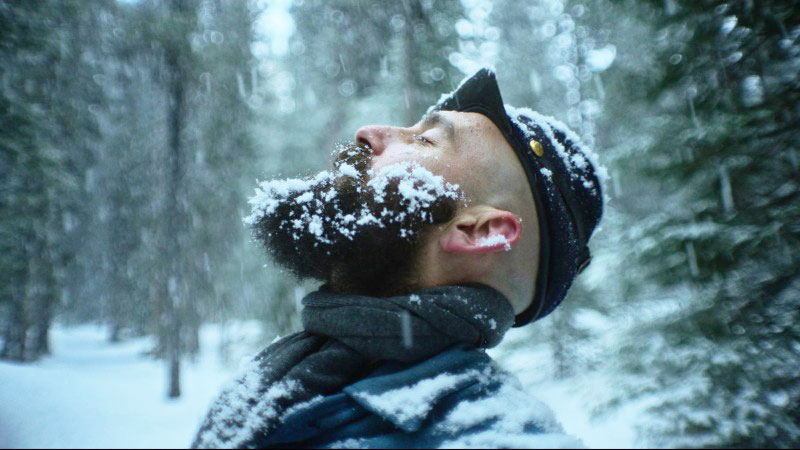
Using the DaVinci Color Transform Language (DCTL), Natalia gained more precise colour control, even on very small details, accurately portraying the snow’s natural reflections and the surrounding elements, such as vegetation and the soldiers' uniforms. She said, “For this scene, applying the grisaille technique allowed me to deeply study light and shadow, incorporating artistic painting principles to give the film exceptional visual depth.” Using only shades of grey, painters use the grisaille underpainting method to focus just on contrast.
DCTL is a scripting language used to create custom colour transformations and effects in DaVinci Resolve. For very precise adjustments, users can write custom code and manipulate colour information at a pixel level.
Mastering
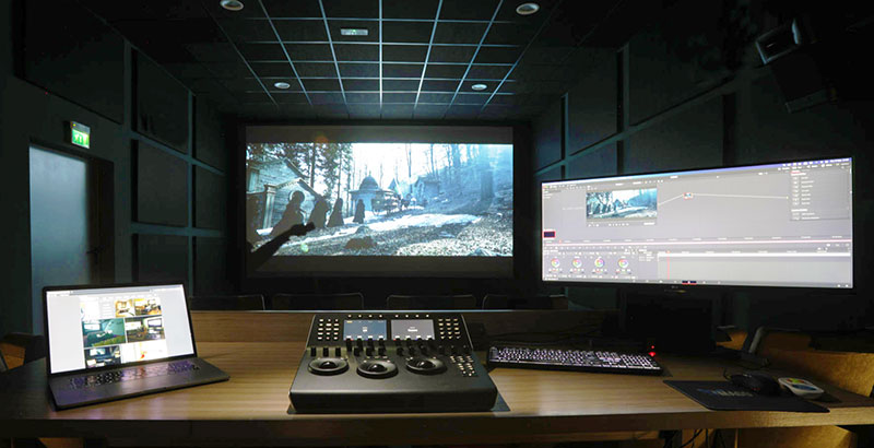
The DI grade took place on a 7m cinema screen in one of IMAGO VFX’s colour and 5.1 sound mix suites, equipped with a Barco cinema projector and DaVinci Resolve Mini Panel.
In the suite, DaVinci Resolve Studio’s 4K DCI dual link video outputs are routed via a DeckLink 8K Pro capture and playback card to the Barco projector through a Blackmagic Videohub 40x40 12G router. For 5.1 audio mixes, the outputs are routed through the DeckLink 8K Pro to a Dolby Digital Cinema Processor CP750, with two Mini Converters SDI to Audio 4K transitioning the signal for the room’s 5.1 system.
“During the mastering phase, we used DaVinci Resolve to create multiple formats for international distribution, including 4K DCI DPX sequences, HD ProRes 4444, and H.264 previews for internal reviews,” said Fabrizio Nastasi. www.blackmagicdesign.com


