DNEG Animation’s Archie Donato and Kapil Sharma talk about animating the visual spectacle of ‘Entergalactic’, tying together the world and characters with colour, light, design and motion.
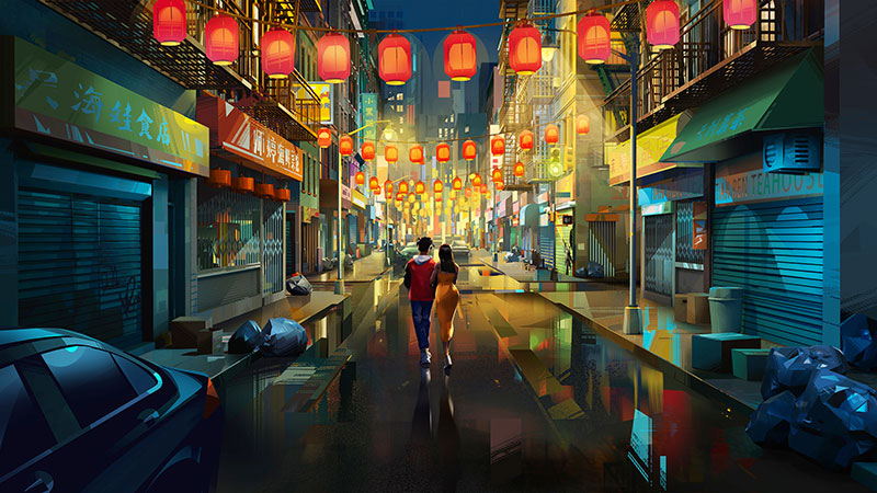
DNEG Animation has animated and helped design ‘Entergalactic’, an ambitious feature film project created by singer and rapper Scott ‘Kid Cudi’ Mescudi and writer/producer Kenya Barris. The movie rolls out as a series of connected stories about life and love in New York City, but what impresses the viewer the most is the visual spectacle that ties its world and characters together using colour, light, design and motion.
The team completed 1,056 final film shots, nearly 60 picture-in-picture shots and 16 still frame renders, animating everything from the lives of the main characters to the bustling streets of New York and thrilling BMX tricks.
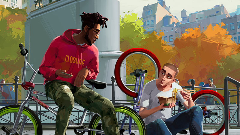
The protagonist is a 2D comic artist named Jabari, recently hired to produce a strip focussed on an enigmatic character he invented called Mr Rager. New Yorkers know Mr Rager already – his life began as outsized works of graffiti that Jabari created on the streets and walls across the city.
In these ways, Entergalactic is a very modern story. The look that Mescudi and Barris had in mind would have to be defined and visualised with care. Stylistically, the DNEG Animation team described ‘Entergalactic’ as the most unusual and challenging project they had ever undertaken.
The intention was to create the look of concept art that comes alive, which meant a complete move away from traditional CG animated looks to give the audience the feeling of stepping into a painting. VFX Supervisor Archie Donato said, “Achieving that feeling required a kind of reverse engineering – breaking our traditional CG pipeline, as well as writing many new tools and developing techniques we had never used before.”
Finding the Look
In terms of animation, Entergalactic gave the team a chance to produce very real, expressive performances. “The animators really enjoyed this process, but we wanted to stay away from a rotoscoped, motion captured feeling,” Animation Director Kapil Sharma said. “We needed an animation style that complimented the final image and, of course, step animation would be the best way to achieve such a painterly look. However, we weren’t always working mathematically on 2s or 3s. It really depended on the shot and emotion we were trying to achieve and what felt good for the moment.”
Following the idea of concept art that comes alive meant the team needed to work more closely than usual with the Netflix production designer and art directors. They were all in constant communication but what really made their relationship unique was the fact that their look targets were extremely consistent and detailed, which allowed them to get to the desired look fairly quickly. Normally, art keys can be rough, and it takes many more iterations to find that look.
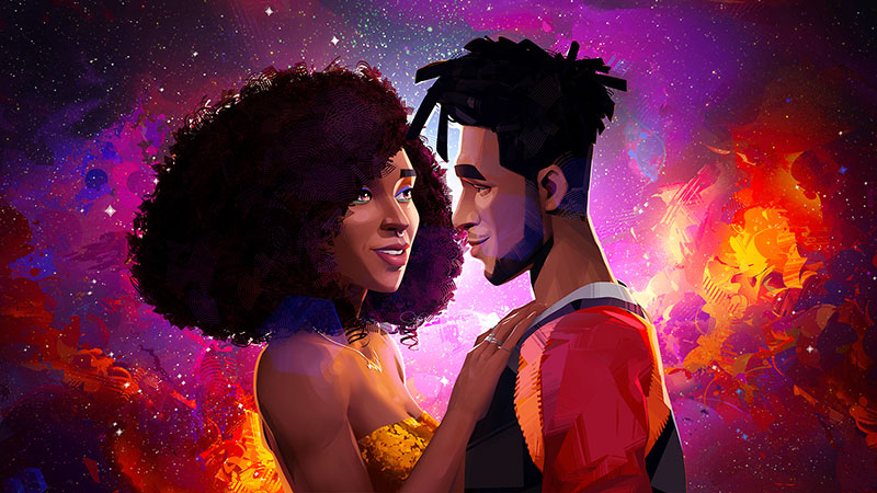
“This was by far the most collaborative project in my career. We met daily with Netflix, at times holding multi-hour marathons with multiple departments. We also had direct access to the director and the production designer at all times for any questions, ideas and advice,” Archie said
“The greatest example of our collaboration was integrating 2D elements into the 3D world. It’s a very tricky process where you have to take 2D hand drawn images and match the camera motion, perspective, stepped animation and full integration of the three dimensional world. We had to break most elements into separate render passes to allow our compositing team to reassemble elements back together. The granularity of those individual passes was something we have never had to do on any other project.”
Bending the Rules
Overall, achieving these looks meant regularly bending the rules of the CG animation pipeline. Every aspect – from shader development to animation performance to compositing – had to be orchestrated in unison to create the feeling of stepping into a painting.
First, just understanding the visual language took a few months at the start of the project. It required constant experimentation but because of the production schedule’s constraints, they had multiple channels of development moving at the same time.
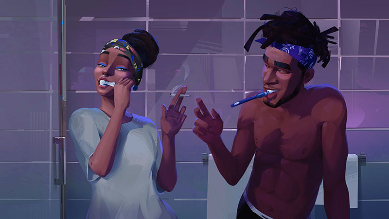
“It was my job to make sure these vastly different challenges actually came together in the final image. Meeting every day with the team to make sure everyone had a clear idea of the target we were moving toward helped this process tremendously,” Archie said. “It also created a bond within the crew that allowed people to help each other reach that target faster.
“The idea from the get-go was to follow a more grounded approach across all aspects of the production. For example, we avoided those fantastical camera moves we are accustomed to in 3D animation and really kept the camera grounded. This is what the director Fletcher Moules and the production designer Robh Ruppel stressed daily. We wanted to tell a love story that happens to be animated, as opposed to setting out to make a 3D animated film.”
Deconstruction
Simulating a hand drawn look involved setting up various complex techniques and workflows. Archie said the simplest way to explain the process is deconstruction of the paintings. “Our production designer and the art director provided us with their actual Photoshop files (.PSDs). Instead of just seeing the completed painting, we could see the process the painter takes to create an image. We could look at individual layers and then recreate every one of those layers in CG. This was absolutely instrumental in accomplishing this very difficult look.”
“In a way, achieving the right feeling was more about understanding what production did NOT want to see on screen. The look was a complete departure from the physicality of CG animation, in which the tools – for FX, Lighting, CharacterFX, Compositing and so on – are designed to mimic real world physics. In this case, it was exactly about forgetting all that and making something unique and beautiful without factoring in the boundaries of the real world.”
Modelling was done in Zbrush and Maya, texturing in MARI, animation in Maya and FX in Houdini. Lighting was handled in Katana and rendering with Renderman, using NUKE for final compositing. Proprietary tools unique to DNEG Animation were also used, as well as Adobe Creative Suite. Forcing traditional 3D animation tools like these to do things they can’t normally do was a challenge in itself that required literally breaking their behaviour and at times entirely re-engineering them.
New Rules, New Tools
This also taught them, as a feature animation company, about exactly how far they can really push the images for future projects, and identified areas of the pipeline they need to improve. “One of our toughest challenges was depth of field,” said Archie. “The director didn’t want to use standard depth of field because it contrasted too sharply with the painted style of the show and distracted the viewer.
“So we developed an effect we called ‘depth of detail’ instead, where the further an object appears from camera, the less detail it has. It was a massively difficult problem to solve. We wrote a whole new workflow and tools for it to control the amount of detail based on the camera‘s proximity to any given object. We also developed some new tools to manage 2D-to-3D integration, and several Nuke nodes to assist us with stylized lens flares that looked hand-painted but acted in a physical fashion. To completely remove traditional aspects like Ambient Occlusion and even the basic behaviours of our CG lights, we had to restructure our lighting pipeline as well.”
Feeling Real
All of the characters are hand animated, although the team needed to bend a few more rules to achieve the style the production were after. Kapil said, “Normally, animation is run on steps of 2. However, to accommodate the acting and the feel of individual shots, in this case we were using a variable step rate. We switched between 2s, 3s and 4s from shot to shot, and even as far as 6s or 8s in a few rare cases.

They received beautiful concept art and character design from Netflix, giving them stylized versions of real characters. Then in animation, the job was to make sure they kept their look throughout every performance. “Initially, we spent a lot of time making sure that rigging delivered what we needed to make these characters feel real. We took each character through Face Calisthenics inspired by real actors, while working closely with the director and production designer,” said Kapil.
“Once our Face Calisthenics were successful, we would put them into a pose library and use them to maintain consistency throughout the movie. Although we had entertained the idea of motion capture at the beginning, we soon recognised that it wouldn’t give us the performance we needed and wouldn’t align with the style of the show.”
From Realism to Fantasy – and Back
Instead, Kapil was able to lean on the talent of his animators who, by looking at the storyboards and the actors’ recordings, would create their own acting reference. A character lead was also assigned to each character, who would often provide acting choices – all of which resulted in a high level of consistency “We really enjoyed the shift between realism and fantasy. We could do some entirely genuine acting and then, within the same sequence, also really push the animation, such as when the characters suddenly float into the sky,” Kapil said.
The facial rigging and animation in particular is very natural, connected to everything the character is doing and to everything else happening in the frame without distracting from the story. “The facial performances required our animators to work very closely with the Rigging and Modelling departments to make sure our faces felt organic,” said Kapil. “Huge credit goes to Ramon Arango, Animation Lead. His great understanding of design and rigging was crucial for us. Once we knew how to handle the main characters the rest were easier to achieve.”
Merging 2D into 3D
Telling a story about a 2D comic artist inside a 3D animated movie called for new techniques to integrate 2D hand drawn animation into 3D scenes. It was also a good opportunity for interesting visual surprises and, as Archie describes it, a great learning experience. “2D and 3D are both animation mediums, but they could not be further apart in a technical sense and execution. The simplicity of 2D animation makes it fluid and organic, whereas 3D animation is extremely complex and very technical. Merging them together was a challenge but also incredibly fun for me and my team,” he said.
“For instance, we used projection techniques but not at all in a traditional way. The paintings provided to us were in 2D so in order for our projections to work, we had to paint in the information that does not exist in 2D painting. Traditional painters look at the composition and depth very differently than what we needed to accomplish when allowing the camera to move THROUGH the painted worlds.”
Alter Ego
Mr Rager plays a key role in the life of the protagonist Jabari, and needed a special approach to give him a strong presence in the movie. He needed to move as a 2D animation across 3D walls and other surfaces without breaking either illusion.
“We would first animate a 3D stand-in for Mr Rager to make sure the performance would work in the given location and shot,” said Kapil. “Then those 3D shots were passed to the Netflix 2D animation team, who would animate their version on top of our 3D stand-in. This process allowed us to give him the proper timing and perspective, and using the 3D as a reference also made it a lot easier for us to integrate their 2D animation back into 3D.”
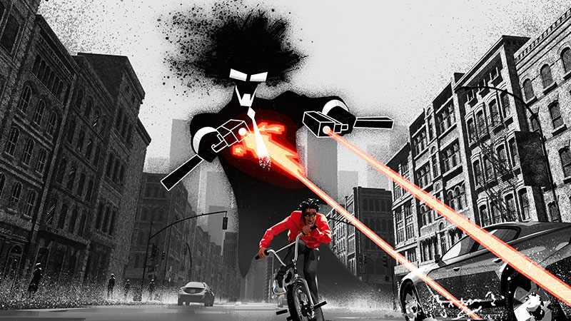
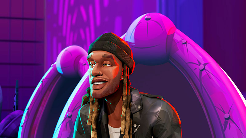
Part of what makes this character so interesting to the audience is that he is an invention of Kid Cudi, as a kind of alter ego. “Fletcher, our director, had a great understanding of this character “When we were in development, he supplied precise reference and a lip sync recording of Kid Cudi that we could then translate into our animation style. Once we had nailed that test, we knew how this character would perform. Huge credit goes again to Ramon Arango who led this character and really made him as likable and charming as Kid Cudi himself,” said Kapil.
Reference and Research
The same minute attention to detail informs every aspect of the project, including representation of the culture and people of New York. Environments take on the role of characters fairly often in films but in Entergalactic, the role of New York City is unmistakable. “We were making a film about young African Americans in NYC and wanted to be as true to that culture as possible – from fashion designed by the late great Virgil Abloh, to the music of Kid Cudi. At our end we researched everything from how to hold a joint properly, to BMX tricks and graffiti, to making stylised devilled eggs,” Archie said.
The fact that this project had some of the most comprehensive storyboards, art and reference packages Archie had ever seen on any production allowed his team to hit the ground running. He was personally able to create hundreds of reference PDF packages for various departments to help them avoid wasting time on countless iterations.
The majority of the material came from Netflix themselves, whose team had assembled a full package of references all the way down to traffic cones and manhole covers. Since many locations are actual places in New York, they had drives full of every possible reference they could get their hands on.
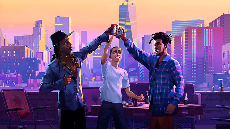
“Our job was to stay as true to the original paintings as possible,” Archie said. “They were so beautiful that we just wanted to do justice to them when we transformed them to 3D, and worked carefully alongside the production design team to prevent deviation from that style.”
Street Life
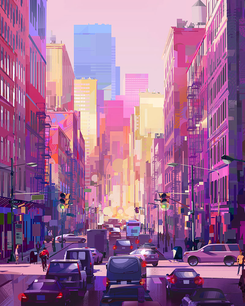
The goal was ensuring the audience feels as though they are physically moving through the NYC streets, which meant adding trash to the dark brick alleyways, scattering construction barriers, garbage trucks, even the potholes that Jabari jumps over on his BMX. In short they avoided a ‘perfect’ version of New York, instead showing the beauty of a vital, evolving city. Everything was geared to make the audience experience the beauty of New York.
Although their NYC is highly stylised, they constantly consulted Google Maps to maintain the width of streets and heights of buildings, and a full 3D model of Manhattan Island to guide them as they populated the buildings. “It was also essential to communicate and maintain, throughout the film, the very distinctive energy that NYC’s street life has compared to any other city in the world,” said Archie. “We used a traffic system for our cars that allowed us to simulate stop signs and red lights, even down to the speed of the cars based on the traffic, plus myriad elements like hot dog stands and other food stalls.”
The crowds were a mixture of 3D crowds and 2D art. The director was very keen to make 2D painted characters come to life in the backgrounds. Kapil said, “One of the art directors painted about 40 unique characters, which we then puppet rigged and animated in After Effects.”
By the time animation was underway, they had completed work on some of the locations done but others were simply a rough layout geometry to give animators the boundaries to work with while they modelled the actual high resolution geometry. Most of the work was done simultaneously.
Behind the Camera
Netflix also left no aspect of film’s cinematography to chance. Although independent of physical light fixtures, cranes and dollies, it still looks fully cinematic. “Netflix had done so much in preparation for the production even before DNEG Animation joined the project. Their storyboards were fantastic,” Archie said. “The director wanted camera motion in the film to be subtle and purposeful, and avoid the fantastical camera moves you normally see in 3D animated films.
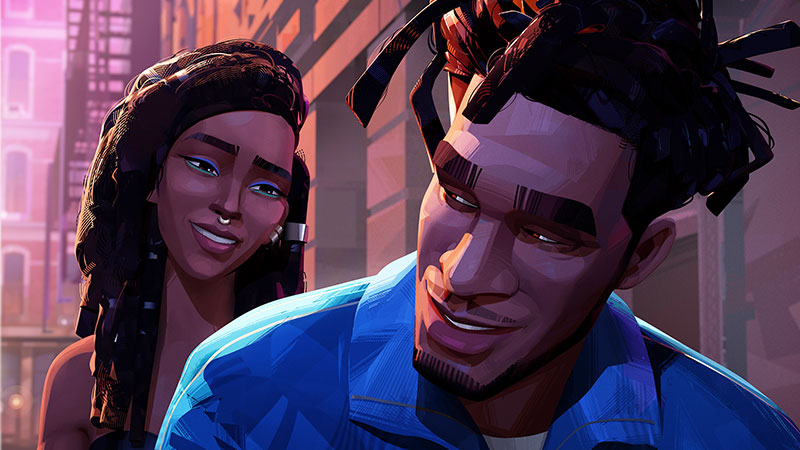
“Instead we took more of a live action-love story approach, which allowed us to avoid breaking the painted style we had worked so hard to accomplish. One film we looked at a lot was ‘When Harry Met Sally’ – a great reference of what a good love story’s cinematic language should be.”
The calmness of the cameras and the editing style let the audience appreciate the feeling of being inside the concept art, but also allowed the team to suddenly snap viewers out of those calm everyday settings to really make the story “go frantic”, as Archie put it. “The Nightmare sequence, for instance, uses camera language that contrasts sharply with the rest of the film. The frantic, fast cutting approach allowed us to take the audience on a crazy ride, only to bring them back to the grounded routine of everyday life in the sequences that follow,” Archie said.
Colour is everywhere in this project, not especially realistic perhaps, but used to describe the moment the story is in at any given time. Archie gives full credit here to Production Designer Robh Ruppel. “Aside from being a virtuoso illustrator, he had an absolutely crystal clear plan for what every sequence’s colour palette should to be. We stuck to that colour script with virtually no deviation. His guidance on this film was absolutely crucial,” he said.
BMX – a Dream State
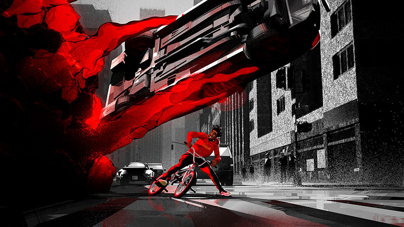
The specialised requirements of Jabari’s BMX stunts also relied on research. A part of the director’s vision was using them as a kind of segue into Jabari’s reveries or dream state, switching over into a fantasy environment of colours and motion. “Fletcher knows BMX stunts really well, which helped us tremendously, and Netflix also provided some great reference that we used to study how BMX works. In the end we became very skilled at creating BMX tricks and action,” said Kapil.
“We also had to spend time figuring out how to achieve a relaxed, easy-going mood with BMX, discovering that there isn’t much of a difference between Jabari’s fantasy world and his real world. The concept was that, in fact, he is always in the dream world and once in a while, the audience gets a peek into it. Letting him float through the air, for instance, was our way of capturing the vibe of space.” www.dneg.com/dneg-animation
Words: Adriene Hurst
Photo credit - COURTESY OF NETFLIX © 2022


